

The Ultimate Fiction Book Cover Checklist
The old saying might work for not making snap judgements about people, but when it comes to books, you most certainly can judge them by their covers.
Or you should be able to, anyway.
If you’re a writer, then getting the right cover designed might be the most important decision you can make.
Because if you get it wrong, it doesn’t matter how good the book is – it will not find its readership.
Having a poor quality book cover means that it may not get picked up at all, but it’s even more complicated than that. Because having the wrong design can also scupper you, even if it’s a great design.
Because the design sets expectations and helps readers find the kind of book they’re going to enjoy. If the cover is misleading, then the people who start your book will be disappointed, and the people who would have enjoyed it will never pick it up in the first place.
In this guest article, expert book cover designers Cover Kitchen share some of their best practices, top tips and outstanding iconic covers of the past.
Let’s see what gems they have for us!
_________
Iconic Book Covers
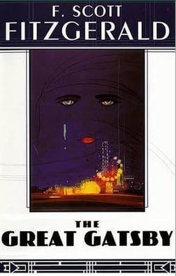
The most iconic book covers resonate across decades and are so familiar we recognize them stripped of author and title.


The Godfather, Jaws and Clockwork Orange all had covers which contributed to their commercial success and created their own cultural relevance.
Jaws: The initial covers were so powerful and fear inspiring that they were used to market the film and are now iconic and inseparable.
The Godfather: Created by S. Neil Fujita, the iconic marionette and stylized type branded the novel and three movies inspired by the book.
Clockwork Orange: The first Penguin UK publication of Clockwork Orange carried the iconic and world famous ‘cog-eyed droog’.
Best-selling author or self-published newbie, getting your book cover right should be a top priority, especially considering the level of competition in the industry right now:
“By 2019, the total number of books published in the U.S. exceeded 4 million in that year alone—including both self-published books and commercially published books of all types.”
According to Publishers Weekly, approximately 11% of books published in a given year are fiction, leaving you competing with 440,000 books yearly. That can be furthe broken down into popularity by fiction genre (where does your novel fit in?):
- Fantasy
- Science Fiction
- Dystopian (Clockwork Orange)
- Adventure
- Romance
- Detective, Crime & Mystery (The Godfather)
- Horror
- Thriller (Jaws)
- LGBTQ+
- Historical Fiction
- YA: Young Adult
- Children’s Fiction
Click here for a breakdown of sales by genre and other interesting book publishing facts!
Whether you are writing sci-fi, romance or fantasy, your book cover is the most important piece of advertising you’ll ever have. Book buyers scroll fast on book-selling sites, so you have only a few seconds to grab eyeballs and clicks. Readers are loyal to their genres; your cover design must reflect its genre or you risk losing readers who would love your story. Your poorly designed cover might mislead a reader expecting romance and give them blood and gore, earning you a negative review.
Three Elements of Successful Novel Covers
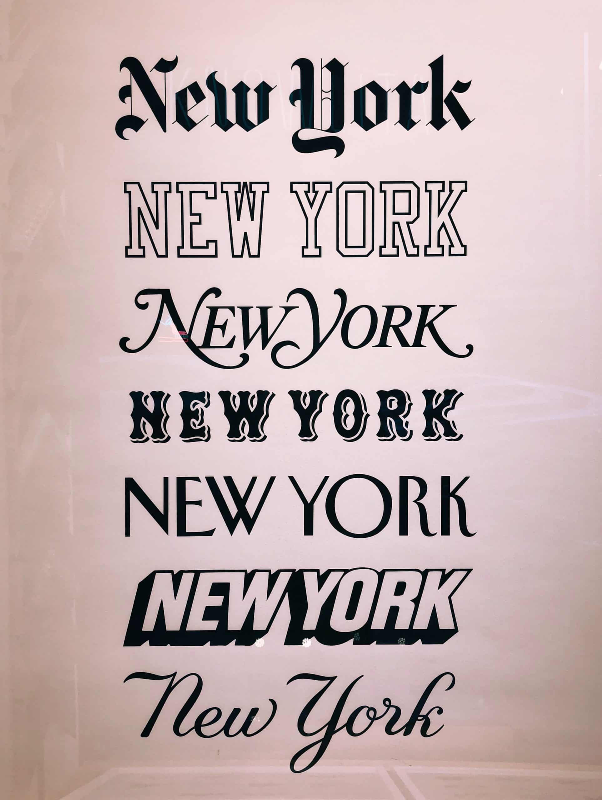
Typography
Your font (or typeface) choice can convey meaning on top of the words they spell out. Fonts help build reader expectation through their visual elements. Genres employ specific fonts, and you should, too! Bold, clear typefaces suggest adventure, while romance is conveyed with softer fonts.
Make sure your font choices are legible and appropriate, as fonts convey intent and purpose:
- SERIF FONTS ARE TRADITIONAL AND CLASSIC: A serif font has small strokes or extensions at the end of its longer strokes.
- SAN-SERIF FONTS ARE CONTEMPORARY AND STYLISH: Sans serif fonts are fonts without the serif or the curve at the top and bottom of the letterforms.
- SCRIPTS FONTS ARE CREATIVE: Script fonts use the cursive handwriting style. They can be formal or informal but they normally have a strong presence.
- MODERN FONTS ARE STRONG: Modern fonts are recognizable by their thin, long horizontal serifs, and clear-cut thick/thin transitions in the strokes.
Remember, less is always more: no more than two different fonts on your cover should do the job.
Cover Motifs
There are various design motifs that convey narrative and genre. These include:
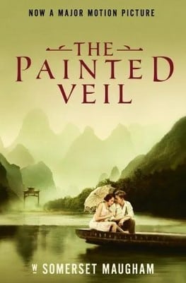
- Main character in foreground: A castle, cityscape, mountain, etc., sets the background mood while a lone figure dominates in front. Keep the image uncluttered and simple to reach the target audience.

- Main character atop, background scene below: A hooded figure superimposed over and above a wolf pack trekking a frozen tundra. Two lovers atop a golden field basked in sunshine. A lawyer, detective, criminal, etc., stands arms folded while through his semitransparent character a man runs through an alley. This creates metaphorical connection between the characters and their environments, and is employed across many genres.
- Overshadowed smaller character: These covers depict plot moments and place less emphasis on character: a bowwoman turns towards us as a massive dragon swoops down overhead, a silhouetted man walks away towards a broken-down city, two characters head off towards a sun-blazed beach. This type of cover design conveys narrative and impact through a specific moment instead of a character.
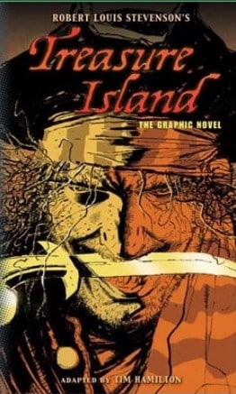
- Focus on facial characteristics: These covers utilize close-ups to make a direct connection between the character and the reader, much like gazing into one’s eyes or studying a face: examples included a bruised and beaten man or a corpse with blood running from their mouth. Facial expressions convey emotion and this type of design works for almost any genre.
- Minimalism: A white bloodied angel’s wing. A boat floating in a moonlit cove, a decorative mask. These single graphic elements, monochrome palettes and austere type is a powerful design type regardless of genre.

Color Palette
Decades of color psychology research proves primal connections between colors and emotional response. While fiction book cover tonal palettes are usually dark, there’s no rules other than strong design. Choose a color scheme based on genre, narrative, tone and mood.
Three Top Considerations When Designing a Book Cover for Your Novel:
- Work with the best: Finding graphic artists experienced in book cover design greatly increases the marketability of your book.
- Details count: Your cover must convey genre and narrative. Your title is the first clue, but your typography, imagery, color choices and design utilize visual clues to strengthen the message.
- Always use high-quality images: Powerful and detailed illustrations will wow potential readers by radiating theme and genre and personality!
Conclusion
Writing (and selling) your fiction takes time, skill and effort: don’t hurt your chances with poor or unprofessional cover design choices. Ensure success by working with experienced fiction book covers designers!
Unlock your writing potential
If you liked this article by the Novel Factory, then why not try the Novel Factory app for writers?
It includes:
- Plot Templates
- Character Questionnaires
- Writing Guides
- Drag & Drop Plotting Tools
- World Building resources
- Much, much more