
Items
Overview
The Items section is where you can create and keep track of the important items that appear in your story, using visuals and prompts to bring them to life.
You can view all of your items as a group, and you can open up individual items to view and edit them in great detail.
The Items prompts help you think about different aspects of your items, such as their history, owners and physical presence.
Go to the Items section by clicking the option in the main navigation with a little diamond icon.
Item Cards Overview
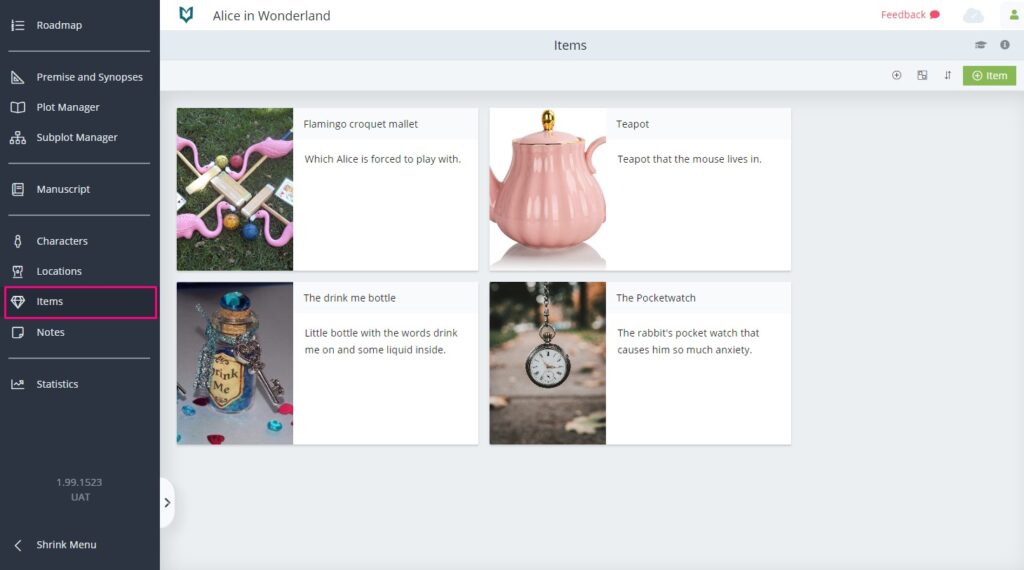
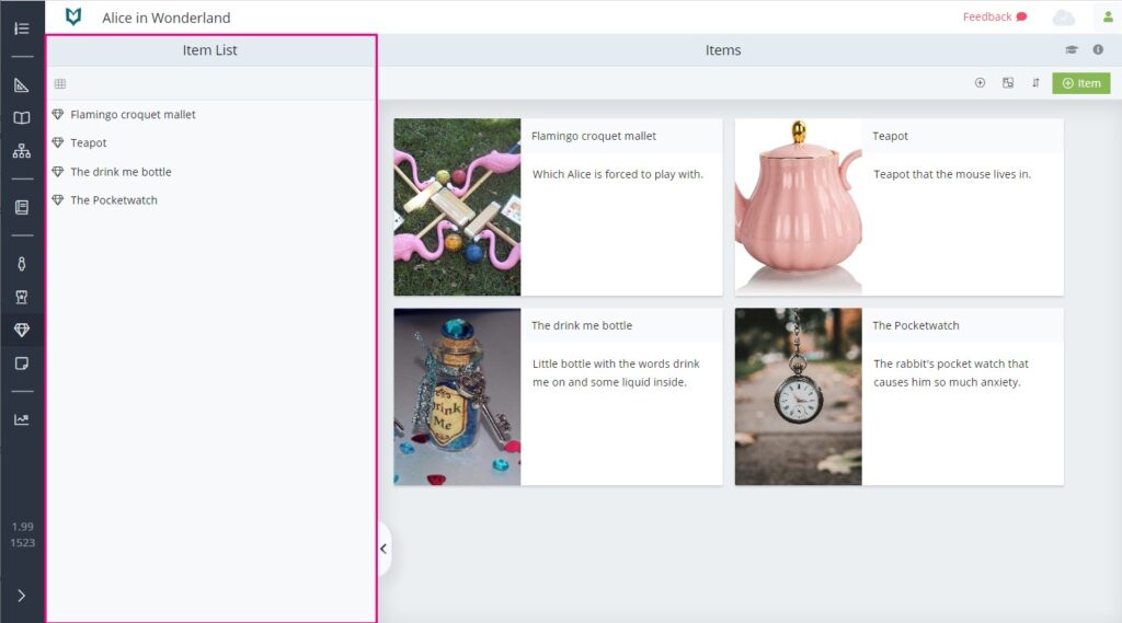
When you first go to the Items section, the main area shows an overview of all your items. Each item is represented by a card, which comprises an image and a brief description.
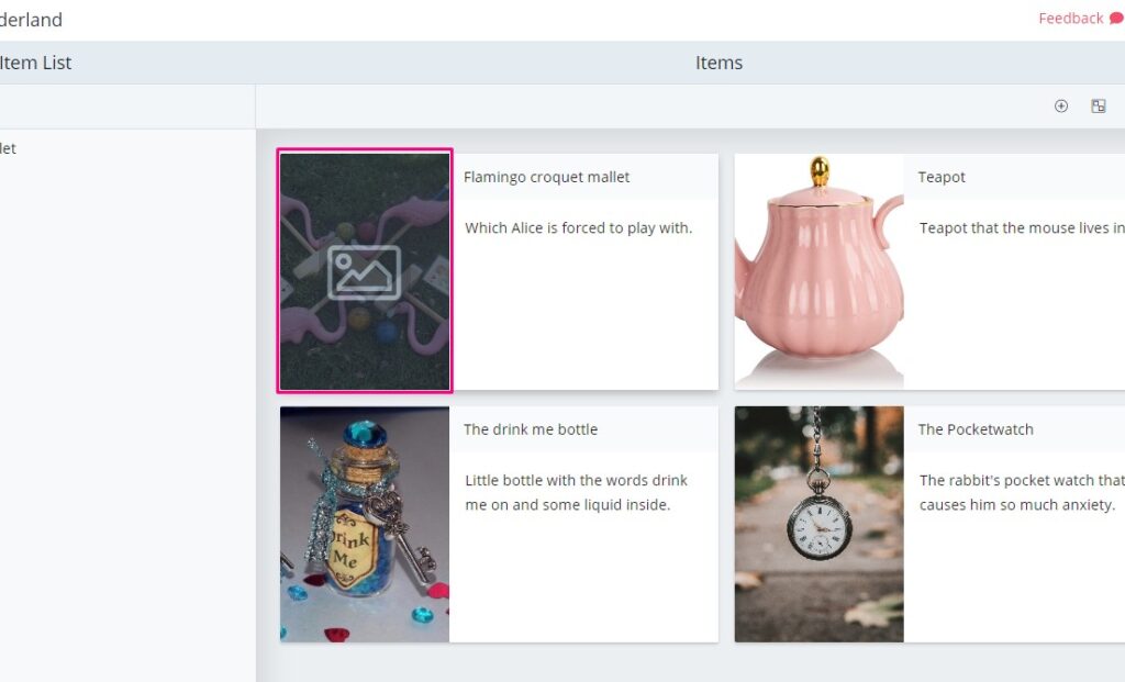
To change an item’s image, simply hover over it and then click. Then you can choose an image from your computer.
To make further edits to the item’s details, hover over the card to make the context menu button appear. Click that, then click ‘Open’. Alternatively you can double click the item card to open it.
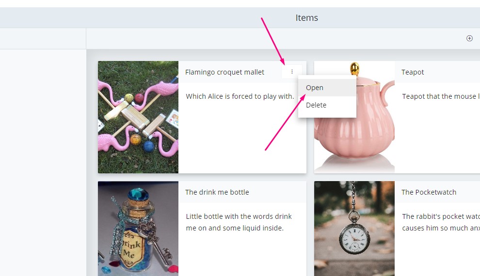
To delete an item, hover over the card until the context menu button appears, then click ‘delete’.
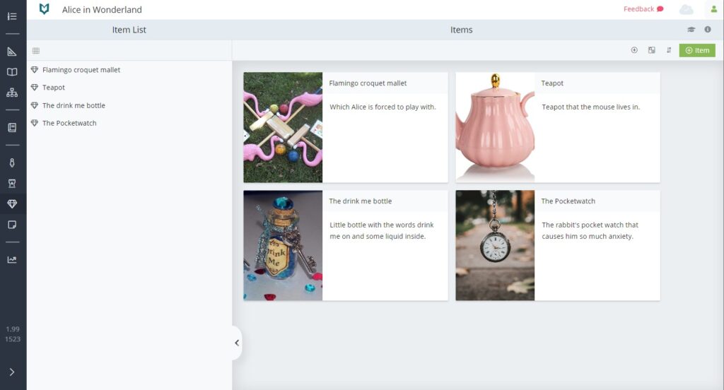
Item List
On the left hand side of the Items section is the Items List.
This list can be hidden and expanded by clicking the little tab towards the bottom.
The Item List shows all of the items that have been created in your novel.
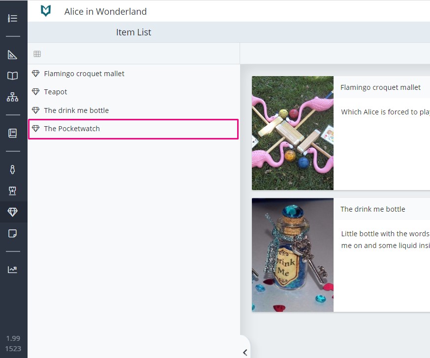
If you click on one of the names in the list, it will open up the details for that item (more on item details below).
Item Details
Each item can be developed in great detail.
Open up an item by double clicking the card, choosing ‘Open’ from the context menu, or by clicking its name in the Item list, as described above.
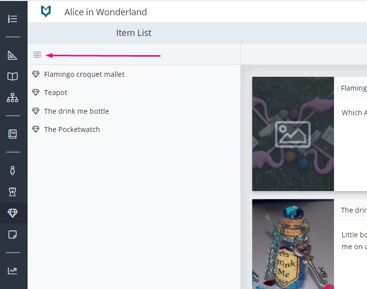
Once you’re in the item details space, the Item List will still be available on the left. You can use this to quickly jump between items without having to go back to the main overview page.
However, if you do wish to go back to the Item Cards Overview, you can do this by clicking the little ‘grid’ icon found towards the top of the Item List.
In the Item Details space you can find panels for the following:
- Basic Details
- Gallery
- Description
- Senses
- History
- Owners
Editing Item Details Panels
The panels have been designed in a way to offer a huge variety of prompts and guidance, whilst keeping the interface as uncluttered as possible.
Most of the panels will initially show you a title, and display a list of the questions which can be found within that panel.
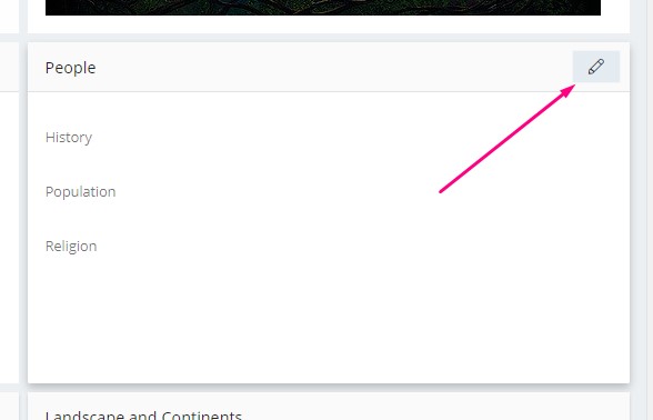
To edit the details of the panel, hover over it and an edit button will appear. Click that button to go into edit mode.
Once you’re in edit mode, the same questions will appear that you saw in view mode, but with spaces to enter your answers.
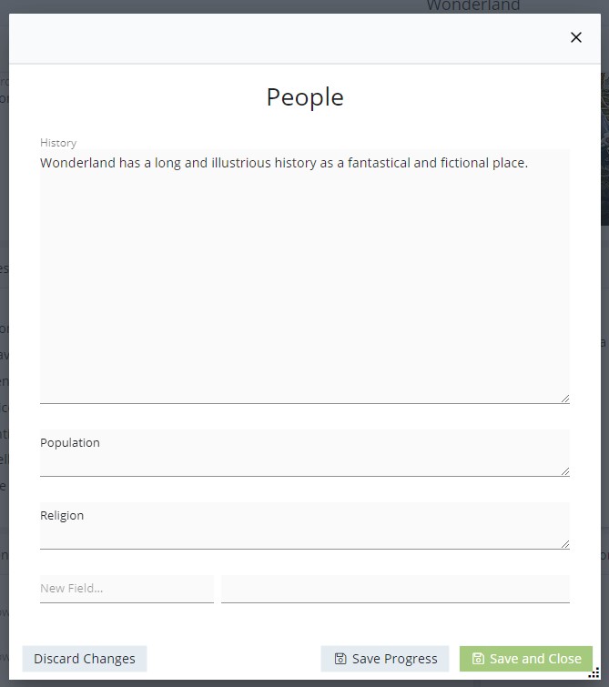
The fields can be expanded by dragging down the bottom right hand corner of any given field.
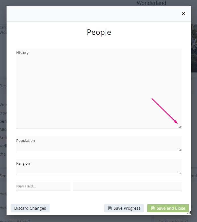
At any point while editing a panel, you can use the buttons at the bottom to discard your changes, save your progress without closing the pop-up, or save your data and close the pop-up.
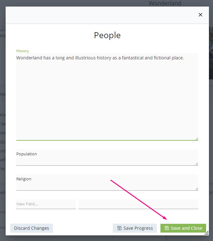
You can enter data for all of the questions or just a few, as suits you. Once you’re done, click ‘Save and Close’.
When you have entered and saved the data, what the panel displays changes slightly. Now, instead of showing a list of all of the questions, it only shows the ones you’ve entered data for.
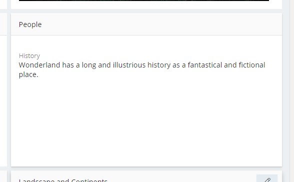
This helps keep the display as streamlined and uncluttered as possible.
However, the questions that you didn’t enter data for are not lost. At any time, you can return to edit mode and all of the questions for that panel will be available.
Editing the Gallery
The gallery works a little differently to the standard panels. If you have added an image to the item card from the Item Cards Overview, then this will automatically be added to the gallery.
To add another image to the gallery, hover over the gallery panel, then click the ‘+’ button which appears.
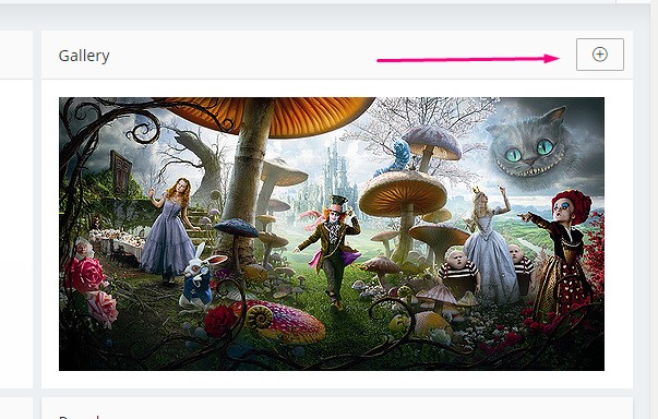
Browse for the image you want on your computer and click ‘open’ to add it to the gallery.
You can change the main image for an item – the one which appears on the item card. To do this, hover over the image you’d like to set as the main image. Click the context menu button (three vertical dots) which appears and click ‘Set as main image’.
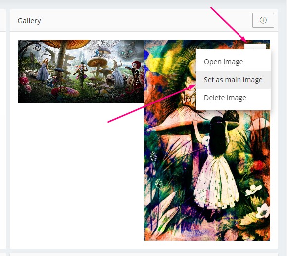
You can delete an image by selecting ‘delete image’ from the same menu.